Dashboard
Pin the resources you actually use to a draggable grid.
The dashboard is the first thing you see after sign-in. It is a grid of pinned resource cards that you choose and arrange yourself. If you do not pin anything it stays empty — that is fine.
Pin a resource
Pinning is done from the dashboard, not from the resource. There are three ways in:
- The add tile. An empty dashboard shows a large dashed tile reading “Click to add to this dashboard”; once it has cards, the same tile shrinks to a + labelled Add. Either one opens a menu — choose Pin a resource and search for what you want.
- Spotlight. The same menu entry opens the Spotlight picker in pin mode: type a few letters and press Enter to pin the highlighted resource.
- Drag. Drag a resource out of the sidebar (or off an account’s detail page) and drop it on the dashboard grid, or onto a dashboard’s entry in the sidebar. Workflows can be dragged the same way.
The desktop app additionally puts a 📌 Pin to dashboard button on each resource pill on an account’s detail page, revealed on hover. There is no pin button on a resource’s own detail page on either platform.
Arrange cards
- Drag a card to move it. Other cards reflow.
- Resize from the bottom-right corner.
- Unpin with the ✕ in the card’s top-right corner — it appears on hover, and its tooltip reads “Remove from dashboard”.
Every kind of card is draggable and they all share one order, so a cost graph or budget can sit between two resource cards rather than being stuck at the end of the grid. New cards are added at the end. The order is per dashboard and shared with everyone in the org.
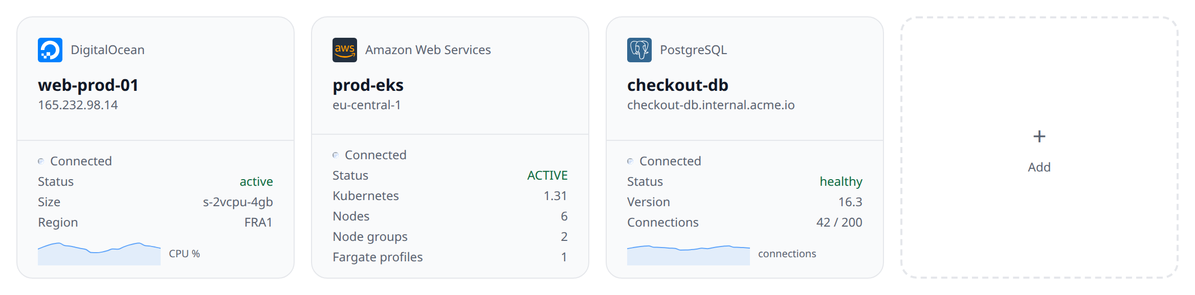
What cards show
Each card shows the same summary the sidebar uses — name, status badge, and one or two key facts (region, size, replica count, etc.). Cards auto-refresh every 30 seconds along with the sidebar.
Historical metrics
Pinned resources accumulate metric history. The dashboard sparkline on each card shows the most recent values; a resource’s Metrics tab draws one chart per reported series, captioned with the window it covers — that window comes from the plugin, and there is no range selector to change it.
Behind the scenes, the poller writes a datapoint every 15 seconds to a time-series store. Raw points are kept for 7 days, 1-minute rollups for 30 days, and 1-hour rollups for a year.
Only pinned resources accumulate history. Unpin a resource and its history stops being collected (existing points age out via the retention windows above).
Unpinned resources still get a chart: when a resource has no accumulated history, the Metrics tab fetches the series live from the provider on demand. The tab itself only appears for resource types whose plugin reports metrics; where a resource has none yet, it says “No metric data yet.”
Cost graphs and budgets
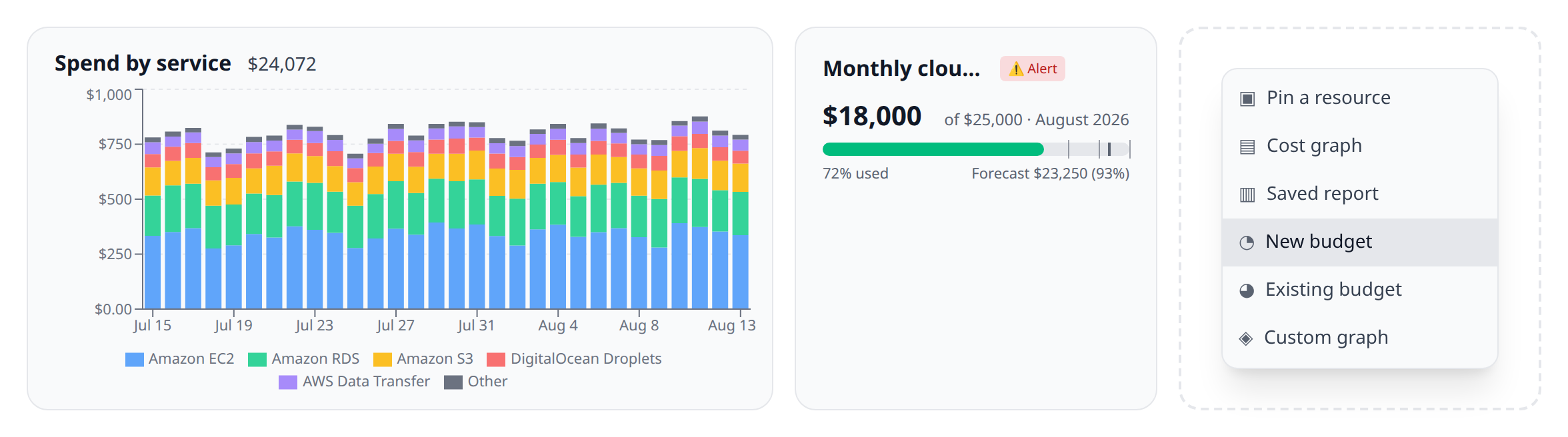
The + tile on a dashboard is a menu: pin a resource, add a Cost graph, place a Saved report, create a New budget, place an Existing budget you already have, or add a Custom graph (cloud orgs only). Cost widgets chart the actual spend of your connected accounts and track monthly budgets with alerts — see Cost graphs & budgets. Custom graphs are script-defined charts with their own controls — see Custom graphs. They drag into place alongside resource cards like anything else on the grid; cost graphs and custom graphs occupy two columns.
Budget cards are views onto a budget, not the budget itself: removing one leaves the budget tracking and alerting, and the Costs panel lists every budget whether or not a dashboard shows it. Saved report cards work the same way — they point at a cost report by id, so editing the report updates every dashboard showing it, and a Cost graph stays the one-off card owned by this dashboard alone.
Multiple dashboards
You can create additional dashboards from Dashboards → New. Useful for splitting by environment (prod, staging) or by responsibility (mine vs team).
On mobile
The mobile app builds and edits dashboards too: New dashboard on the Dashboards tab, then Edit on a dashboard to add cards, reorder them, configure a cost graph or budget, and rename or delete the dashboard. Cards move with Move up / Move down instead of being dragged, and a cost graph’s custom absolute date range stays on web and desktop — everything else is the same options over the same API, so a dashboard built on a phone opens unchanged here. See building a dashboard on the phone.
When the dashboard is worth using
- You manage five or more accounts and do not want to hunt through the sidebar.
- You run the same smoke-check daily (is the prod DB healthy? is the worker pod running?).
- You want a wall-display view during an incident.
If you only have a handful of resources, the sidebar is usually fast enough — don’t feel you have to pin everything.