Cost graphs & budgets
Spend graphs, budgets, and overspend alerts for your connected accounts, right on the dashboard.
Cost graphs turn the billing data from your connected provider accounts into dashboard widgets: spend over time, broken down by provider, account, service, region, resource, or tag — plus monthly budgets that alert you before the bill does.
The Costs panel in the sidebar is where your budgets live. Dashboards show cards, but the panel is the list — see The Costs panel.
A graph you want to keep, name, and reuse is a cost report — the same graph as an org object, with its own page and its own id, referenced by any number of dashboards. See Cost reports.
If what you want is not spend but cost per unit of the thing your business does — per customer, per request, per GB — declare a business metric and any cost graph will divide by it. Same page covers margin.
If what you want is the rows rather than a graph — a recurring dump into a warehouse or a finance system — that is a cost export: CSV or NDJSON, on a schedule, to an S3-compatible bucket or an HTTPS endpoint, with the restatement handling that makes the numbers reconcile. See Scheduled cost exports.
Cloud only. Cost collection runs on Infrawrench Cloud’s background pollers and time-series store. On the desktop app the widgets appear when you are signed into a cloud org; local-only mode does not collect cost data.
Costs are billed history. For what a resource you are about to create or resize would cost, see live cost estimates.
Add a cost graph
- Open a dashboard and click the + tile.
- Choose Cost graph.
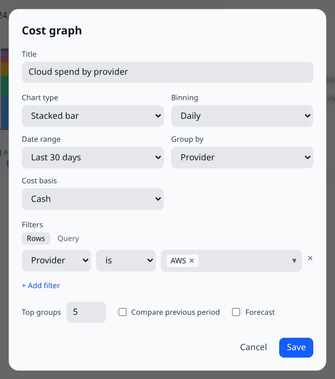
- Pick a chart type, date range, and grouping, then Save.
This card belongs to this dashboard and nothing else. To save the same configuration under a name and put it on several dashboards at once, make a cost report instead and choose Saved report from the same menu.
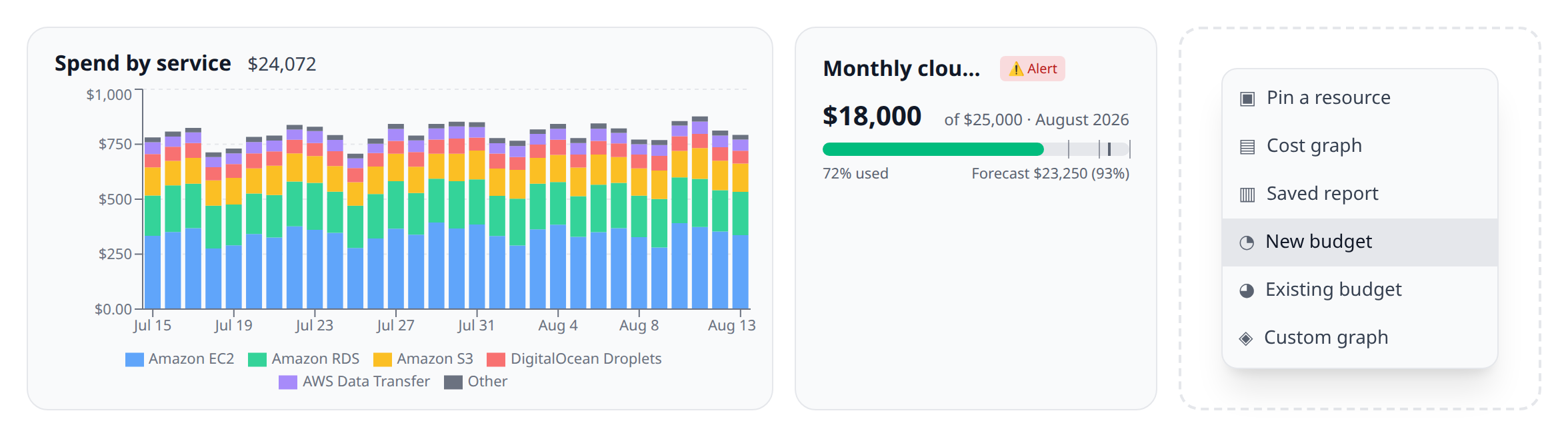
Cost and budget cards drag around the grid like pinned resources, and share the same order — see Arrange cards.
What you can configure
| Option | Choices |
|---|---|
| Chart type | Stacked bar, multi bar, line, area, pie |
| Binning | Daily, weekly, monthly, cumulative |
| Date range | Last 7/30/90 days, month/quarter/year to date, last month, last 12 months, or custom dates |
| Group by | Provider, account, service, region, resource, tag, charge type, or commitment |
| Filters | Any of the same dimensions, is / is not, multiple rules — as rows or as text |
| Cost basis | Cash (what you were charged) or Amortized (commitments spread over the term they buy) — see below |
| Top groups | Show the top N groups (default 5); the rest fold into Other |
| Compare | Overlay the previous period as a dashed line, with a % change badge |
| Forecast | Project the recent trend forward as a dashed continuation |
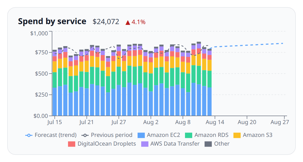
Currencies are never merged: if your accounts bill in more than one currency the graph shows one series per currency and says so under the title.
Annotations
Every cost chart — this card included — draws the org’s annotations: dated notes explaining what happened, marked on whichever bucket holds their day. Click a bar to write one, or read the ones already there from the numbered strip under the chart. A card on a dashboard belongs to no report, so it shows the org-wide notes; a cost report also shows its own. Annotations are an overlay and never change a series, a total, or an axis.
Filters as text
Filter rows are the discoverable way to narrow a graph: every dimension is in the dropdown and every value comes from your own spend data. They are awkward everywhere else — in a script, in an API call, in a message to a colleague. So the same filter can also be written as one line of text, in the cost query language.
The Query toggle above the filter rows switches between the two. They are two views of the same filter, not two filters: switching either way keeps exactly what you had, and whatever you save is the same structure a graph built from rows would have saved.
![Cost graph config modal with the filter editor in Query mode, showing the text box containing provider = 'aws' AND tag['env'] != 'dev' and the Rows/Query toggle above it](https://agent-assets.infrawrench.com/docs-screenshots/features/cloud-costs/cost-graph-query-mode.png)
The grammar
query     := (nothing) | term (AND term)*
term      := dimension operator value
dimension := provider | account | service | region | resource | tag['key'] | charge_type | commitment
operator  := = | != | IN | NOT IN
value     := 'text'            for = and !=
| ('a', 'b', …) for IN and NOT IN- Keywords (
AND,IN,NOT) and dimension names are case-insensitive. - Values are quoted, with single or double quotes. A quote inside a value is escaped by doubling it (
'it''s') or with a backslash ('it\'s');\\,\nand\talso work, and an escape that isn’t one of those is an error rather than a silently dropped backslash. - The
tagdimension takes its key in brackets, because a tag filter needs a key as well as a value:tag['owner'] = 'platform'. - An empty query means no filter, the same as no rows.
Worked examples
| Query | Reads as |
|---|---|
provider = 'aws' | AWS only |
region != 'us-east-1' | everything except us-east-1 |
service IN ('AmazonEC2', 'AmazonS3') | EC2 and S3 |
charge_type NOT IN ('credit', 'refund') | gross spend — drop the things that offset it |
tag['env'] = 'prod' | resources tagged env=prod |
provider = 'aws' AND tag['team'] IN ('core', 'ml') | AWS spend owned by either of two teams |
commitment != '' AND charge_type = 'usage' | usage covered by a commitment |
There is no OR
Terms are joined by AND, and that is the whole story: a cost filter is a conjunction, and there is nowhere in a saved graph to record anything else. Writing OR is an error rather than something that quietly runs as an AND and hands you a number that is not the one you asked for.
Most uses of OR are really a list of values for one dimension, which IN covers:
provider = 'aws' OR provider = 'gcp'      ✗ rejected
provider IN ('aws', 'gcp')                ✓ the same question
Genuinely unrelated alternatives — “AWS in Europe, or GCP anywhere” — need two graphs. The same is true of anything else the filter cannot express: LIKE, >, and grouped parentheses are all parse errors, because a query language that quietly means something other than what it says is worse than one that refuses.
When a query doesn’t parse
Errors say where. The character offset, what was expected there, and — for a misspelled dimension — the nearest real name and the full list:
$ infrawrench costs --where "provider = 'aws' AND regionn = 'us-east-1'"
--where: Unknown dimension "regionn". Did you mean "region"? Valid dimensions are
provider, account, service, region, resource, tag, charge_type, commitment.
  provider = 'aws' AND regionn = 'us-east-1'
                       ^^^^^^^
In the graph editor the same message appears under the text box as you type, and Save stays disabled until the query parses — the rows can only show the last query that worked, so a half-typed one is never silently saved or discarded.
From the CLI
infrawrench costs --where "provider = 'aws' AND tag['env'] != 'dev'" --last 30d --group-by serviceThe filter is compiled before the request goes out, so a typo fails immediately, and --json echoes both the text you wrote and the structure it compiled to.
From the API and the model
POST /costs/query accepts the same text as an optional query field, as an alternative to the structured filters array — see the HTTP API. Sending both is an error rather than a precedence rule, and a query that doesn’t parse comes back as a 400 carrying the offset. The query_costs MCP tool takes it too, which is usually how the model writes a filter.
Saved filters
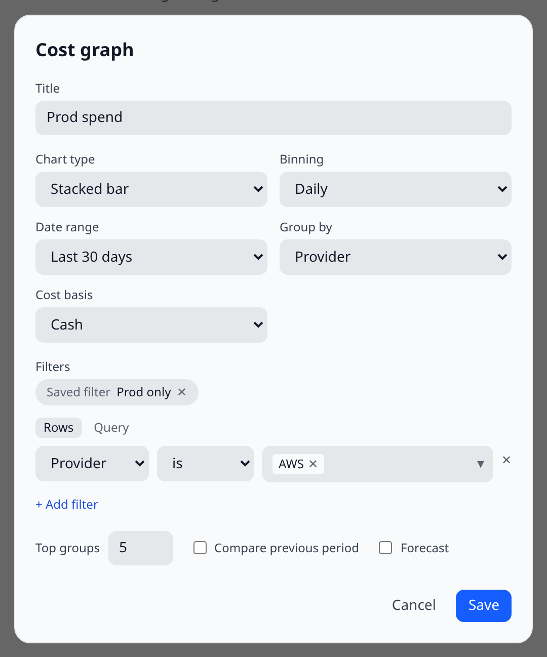
The same filter — “prod only”, “team platform’s accounts” — tends to get rebuilt by hand in every graph, report and budget. A saved filter makes it a named object instead: build the rows once, give them a name, and apply the name everywhere.
The important part is that applying a saved filter is a reference, not a copy. A graph, report or budget stores the filter’s id, and the server looks the rows up every time the query runs. Edit “prod only” once — add the new production account — and every graph, report and budget using it changes on its next refresh. Nothing ever holds a stale copy.
Applying and creating one
Every filter editor — the cost graph editor, the report editor, and the budget scope — has an Apply saved filter… picker. The applied filter appears as a chip; inline rows underneath stay available and are combined with the saved filter by AND, so “the saved prod scope, further narrowed to this one service” is one chip plus one row.
Going the other way, once you have built rows worth keeping, Save these rows as a filter… names them and swaps the rows for the chip.
Saved filters are managed on the Costs panel, in the Saved filters section under your budgets — that is where the objects they scope live. Each row shows the filter as query text; editing one warns you what it will re-scope by naming every graph, report and budget that references it.
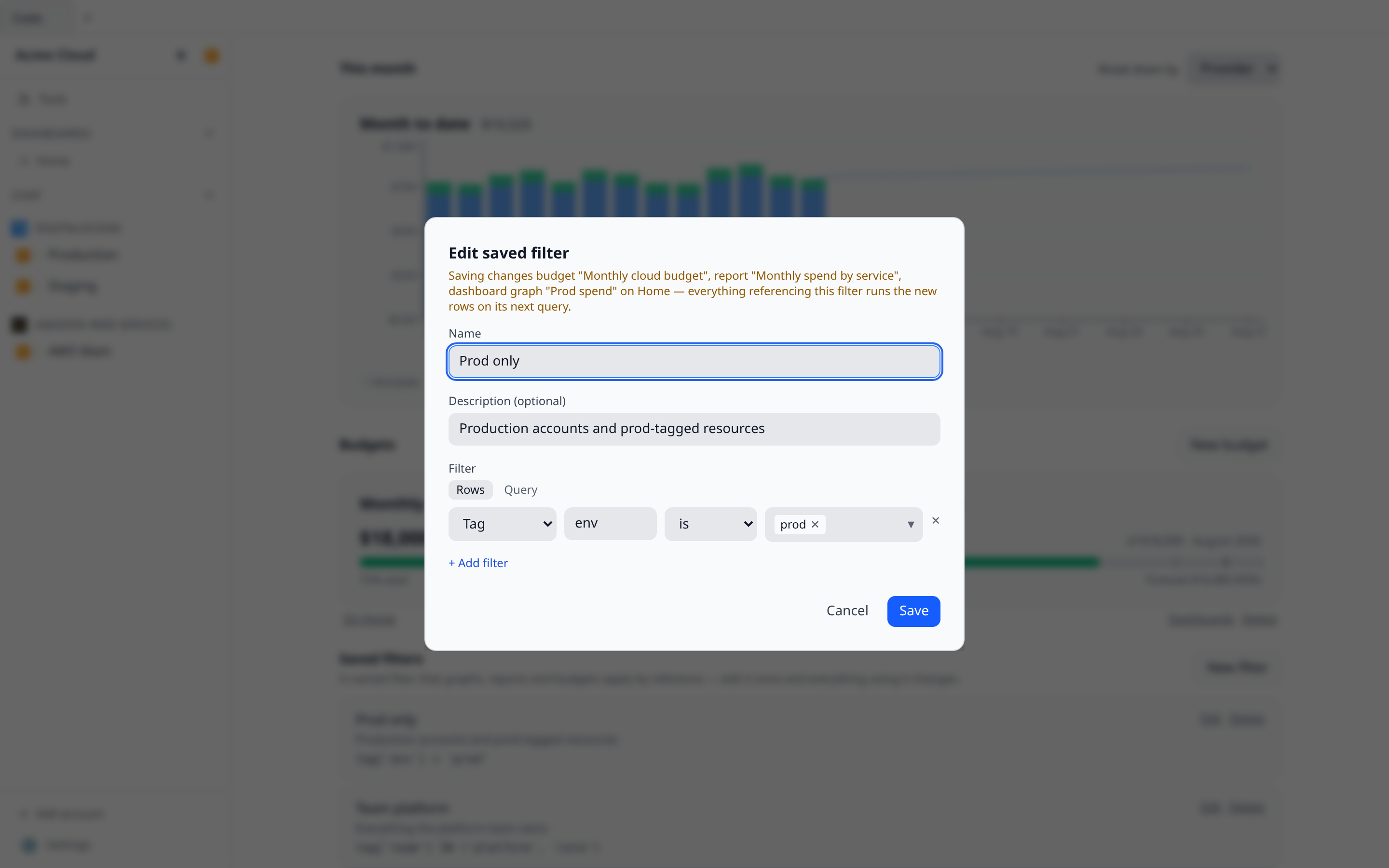
Deleting one is refused while it is in use
Deleting a saved filter that a budget still references would silently widen that budget to all spend — which could fire alerts that shouldn’t fire, or worse, keep quiet ones that should. So deletion is refused while anything references the filter: the error names every referent (budgets, reports, dashboard graphs), and you detach them deliberately first. For the same reason, a reference that fails to resolve at query time — a race, corrupt data — makes the query error rather than silently run unfiltered.
From the CLI, the API and the model
infrawrench costs --filter "prod only" --last 30d --group-by service
infrawrench costs --filter "prod only" --where "provider = 'aws'"   # AND-composed
--filter takes the saved filter’s name or id and sends the id — the rows are resolved on the server at query time, exactly as for a graph or budget, so the flag always means what the name means everywhere else. --json echoes the id, name, and the rows it resolved to.
On the API, POST /costs/query takes an optional savedFilterId alongside filters or query (it composes with them, unlike those two with each other), and /saved-cost-filters offers CRUD plus GET /:id/referents. The model reaches the same thing through the list_saved_cost_filters MCP tool and query_costs’ savedFilterId.
On your phone, graph and budget sheets show an applied saved filter read-only, with the query text it currently resolves to; creating and editing saved filters stays on web and desktop.
Charge types, and cash vs amortized
A bill is not all one thing. Alongside the usage you consumed, providers charge you for commitments you bought, refund you, credit you, and tax you — and if all of that lands in one number, a month where usage doubled can look flat because a credit absorbed it.
Every cost row therefore carries a charge type:
| Charge type | What it is |
|---|---|
| Usage | Consumption billed on demand. The default, and most of any bill. |
| Commitment-covered usage | Consumption a reservation, savings plan or committed-use discount covered. Still consumption — the commitment is in the rate, not in what kind of charge it is. |
| Commitment fee | Buying a commitment: a reservation’s up-front payment, a savings plan, a committed-use contract. |
| Commitment discount | The negative line where a commitment covered usage that would otherwise be on-demand. |
| Credit | Promotional or negotiated credit applied against the bill. |
| Tax | VAT, sales tax and the like, billed separately from the service. |
| Refund | Money returned for a past charge. |
| Adjustment | A billing correction that is none of the above. |
| Support | A support plan, usually priced off the rest of the bill rather than off any one service. |
| Other | A category the provider distinguishes that doesn’t map onto the ones above. |
Group by Charge type to see the split, or filter on it to answer a specific question — “consumption only, ignore the credits” is the one worth knowing, because it is the number that tells you whether spend is actually growing. Select both usage types for that: covered hours are consumption too, and leaving them out understates exactly the workloads you committed to.
Commitment-covered usage is worth nothing on a cash basis, everywhere. AWS prices reservation-covered hours at an unblended rate of zero and Azure prices them at an effective price of zero, because the money left your account when you bought the commitment. Pair that charge type with the amortized basis below to see what those hours are actually worth — it is also the basis the Commitments coverage figure is computed on, for exactly this reason.
Not every provider distinguishes these. Where a provider doesn’t, or where the data predates this, its rows are Usage — which is what they were always assumed to be.
Cash and amortized
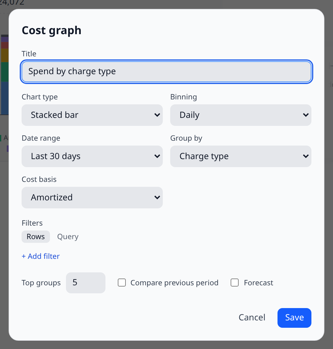
Cost basis decides which number the graph sums.
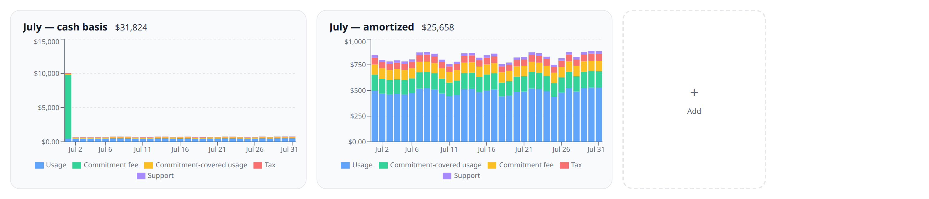
- Cash is what the provider charged, on the day it charged it. This is your bank statement, and it is what every graph showed before this existed.
- Amortized spreads a commitment’s up-front fee across the term it actually buys. A one-year reservation paid up front is one enormous charge on the purchase day and 1/365th of it on each of the 365 days it covers.
If you hold reservations, savings plans, or committed-use discounts, amortized is the honest number. On a cash basis the month you sign a three-year commitment looks like a catastrophe, and every month after it looks suspiciously cheap — neither reflects what your infrastructure cost to run in that month, and a budget on a cash basis will breach on the purchase and then sit quiet for three years. Amortized answers “what did July cost us”; cash answers “what left the bank in July”. Both are real questions; they just aren’t the same one.
Providers that don’t report an amortized amount fall back to their cash amount rather than dropping out — so an amortized graph over a mixed estate is still the whole estate, with the commitments spread and everything else unchanged. The option only appears when at least one connected account’s provider reports amortized cost; otherwise the two views would draw the identical graph.
Budgets take the same setting, and it’s the same reasoning: a budget tracking amortized spend keeps alerting sensibly through the term of a commitment.
From the terminal the same two questions are infrawrench costs --basis amortized and infrawrench costs --charge-type usage (repeat the flag for more than one kind); --group-by charge_type prints the split. The text output names the basis next to the total, so a number copied out of it says what it is.
When the number is an estimate
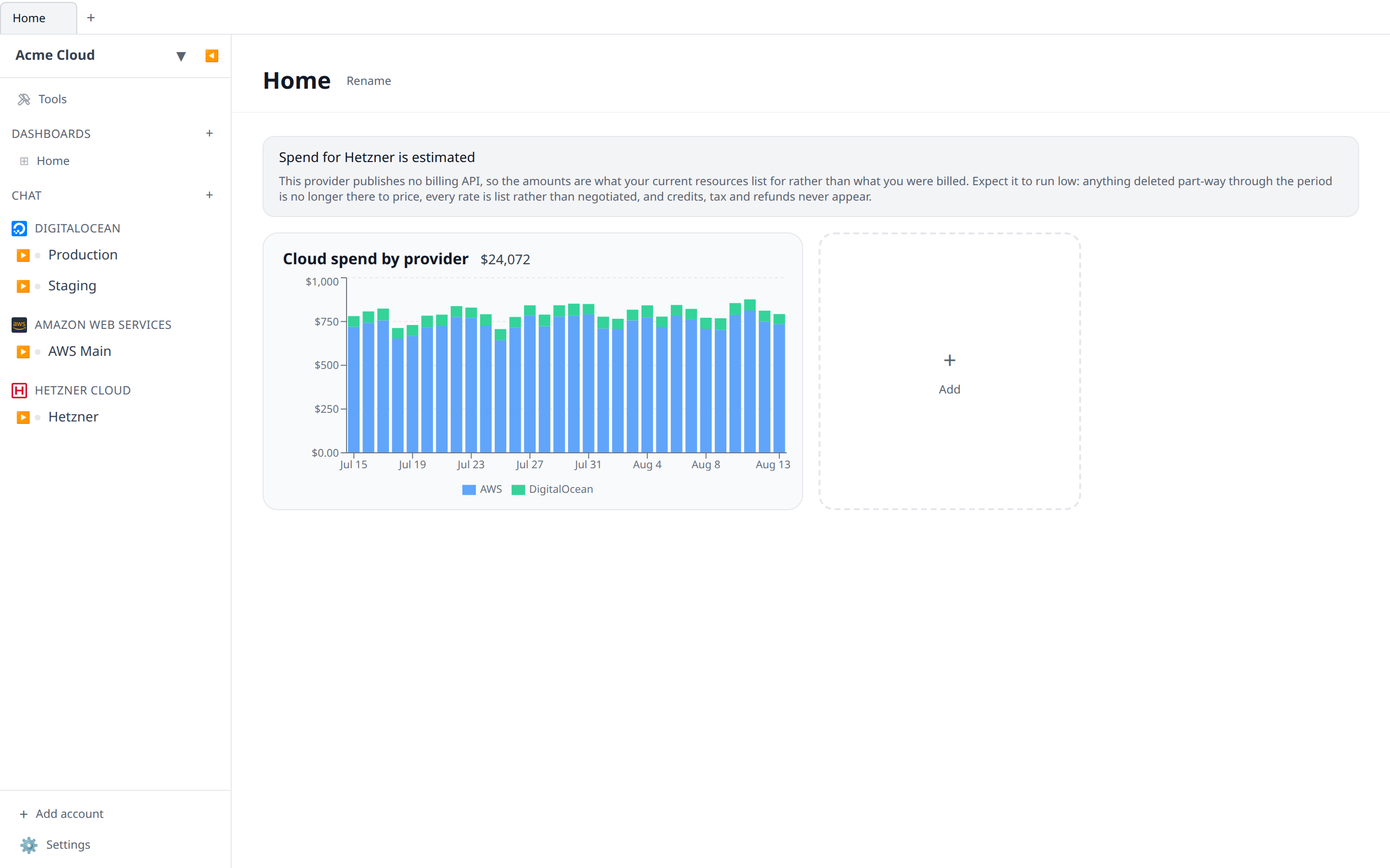
Some providers publish no billing API at all. For those, Infrawrench prices your inventory against the provider’s published rate card instead — so you still get a spend graph, but it is a calculation rather than an invoice, and any graph whose scope includes such an account says so above the chart.
Expect an estimate to read low, in three specific ways:
- Anything deleted mid-period is missing. Inventory is what exists now. A machine that ran for three weeks and was destroyed on the 22nd isn’t there to price, and neither are the three weeks it cost you.
- Every rate is list. Negotiated pricing, volume tiers, committed-use and sustained-use discounts are all invisible to a rate card.
- Non-resource lines never appear. Credits, tax, refunds and one-off charges have no resource to hang off.
Check the plugin’s page under Plugins to see whether its costs are collected or estimated before you reconcile a number against a bill.
infrawrench costs prints the same note above the chart and lists these accounts as estimatedAccounts under --json. Over GET /costs/status it is the estimated flag on each account, alongside chargeTypes and amortization.
Currency
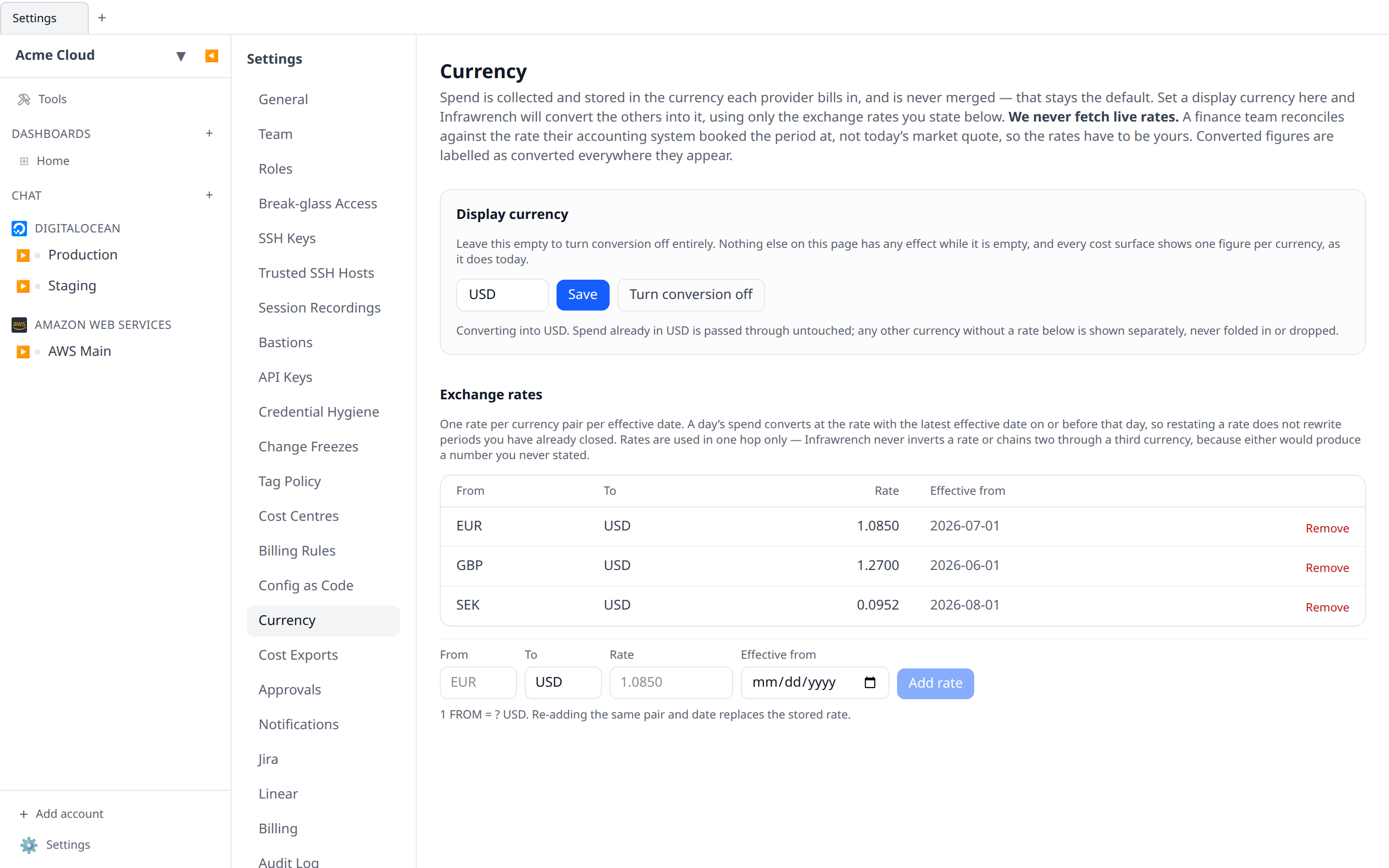
Spend is stored in the currency each provider bills in, and currencies are never merged by default. A graph whose scope covers a EUR-billing account and a USD-billing one draws one series per currency and says so under the title, and the total reads €4,100 + $9,300. That is the honest answer, and it stays the default — but it means an org billing in two currencies cannot answer “what do we spend”, which is a real gap.
Settings → Currency closes it, as an explicit opt-in. Set a display currency, state the exchange rates yourself, and every cost surface folds the currencies you have priced into that one.
It is off until you turn it on
An org with no display currency configured behaves exactly as it did before this feature existed — same series, same per-currency totals, same digest lines. Nothing starts merging currencies on its own, and clearing the display currency turns conversion off everywhere without deleting the rates you have stated, so you can switch it back on later without re-typing anything.
The rates are yours
Infrawrench does not fetch live exchange rates, and this is deliberate rather than a gap. A finance team reconciles a converted total against the rate their accounting system booked the period at — a decision somebody made and recorded — not against today’s mid-market quote. A monitoring tool that silently applied its own rate would produce a number that disagrees with the ledger every single month, and the disagreement would be invisible.
So you state the rates. Each one is a from-currency, a to-currency, a rate, and an effective date:
- A day’s spend converts at the rate whose effective date is the latest one on or before that day. Restating a rate for this month therefore does not rewrite periods you have already closed.
- A range spanning a rate change is converted per day and reported as a blend — the caveat under the figure names every rate that was applied.
- Rates are used in one hop. Infrawrench never inverts a rate (a USD→EUR rate is not treated as evidence about EUR→USD) and never chains two through a third currency, because both would produce a number you never stated and cannot defend.
- One rate per currency pair per effective date. Re-adding the same pair and date replaces the stored rate, which is what correcting a typo should mean — two rates on one day would make “the rate that applied” ambiguous.
- Rates are stored as exact decimals, so the digits you type are the digits stored and echoed back.
Stating or removing a rate needs the org settings permission and is recorded in the audit log. Reading the table only needs costs:read: anyone who can see a converted total needs to be able to see what produced it.
Converted numbers always say they are converted
A total that quietly mixes currencies is worse than two totals, so every surface that shows a converted figure labels it — the graph card’s footnote, a notice above the Costs panel, the weekly digest, the mobile cost cards, and infrawrench costs in both text and --json output. The label names the currencies that were folded in and the rate used for each.
Spend already in the display currency is never converted. It is passed through untouched rather than multiplied by a rate of 1.
A currency with no rate is shown, not dropped
This is the important one. If your data contains a currency you have not stated a rate for, Infrawrench does not quietly leave it out of the total — that would understate your spend, which is the worst thing this feature could do. Instead:
- It keeps its own series and its own entry in the totals, in its own currency.
- A notice names it explicitly: “Spend in SEK is not included in the USD figure — no exchange rate is configured.”
The same applies to a currency you have priced but not far enough back: if any day in the range falls before the earliest rate you stated for it, that currency is left unconverted as a whole rather than half-converted, because a partly converted series reconciles against nothing. Add an earlier effective date to include it.
Budgets
A budget keeps its own currency — the display currency does not re-denominate a budget somebody set, and every threshold and alert stays in the budget’s own currency.
What changes is which spend counts. A budget has always counted only spend already in its own currency, silently ignoring the rest. When a budget’s currency is your org’s display currency, it now converts your other currencies’ spend into it first, using your stated rates, so a USD budget in a mixed-currency org tracks the org’s actual spend. A budget in any other currency, or an org with no display currency, behaves exactly as before.
The gate is that equality because rates point to the display currency in one hop — there are simply no rates pointing at a GBP budget in a USD-display org, so “convert into the budget’s currency” would have nothing to use. A budget is a single number and cannot carry a second currency alongside it, so a currency with no rate really is excluded here — and the alert message says so, naming it.
Elsewhere
- Showback converts per cost centre, on the rate in force on the last day of the period rather than per day: a chargeback is a statement about a closed period, and “August, at the August rate” is a sentence a finance team can reproduce.
- The weekly digest follows the org’s display currency and adds the same caveat line under the spend figure, instead of one line per currency.
- The CLI takes
--currency USDoninfrawrench costs. The conversion caveat prints above the chart in text mode and rides along under--json, including the currencies that could not be converted. - Mobile shows converted totals with their caveat. The rate editor is web and desktop only — stating a rate is a finance-governance act done once a period against a system that is not on a phone.
Budgets & alerts
A budget is a monthly amount tracked against a scope — all spend, or a filtered slice (one provider, one account, a tag). Create one from the Costs panel, or from a dashboard’s + tile → New budget. A budget also picks a cost basis: leave it on cash to track what you are charged, or switch it to amortized so a commitment purchase doesn’t blow the budget in the month you sign it.
Each budget has one or more thresholds:
- Actual spend thresholds fire when month-to-date spend crosses a percentage of the budget.
- Forecast thresholds fire when the projected month-end total crosses it — early warning while there is still time to react.
Every threshold fires at most once per calendar month. Alerts show up as a badge on the budget card, as a mobile push notification to org members who have the app installed and budget alerts enabled in their per-org notification preferences, in any Slack or Microsoft Teams channel opted into budget alerts, and — if your org has Twilio configured on the Settings → Notifications page — as an SMS to your on-call recipients.
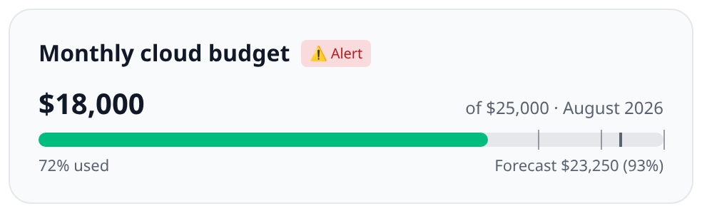
Budgets alert on totals you chose. For spend you didn’t see coming — a provider or service suddenly billing far above its own baseline, or one that had never billed at all — see cost anomaly alerts, which work with no configuration and can be tuned if the defaults are too loud or too quiet. Anomalies can text the same on-call recipients as a budget crossing, but unlike budgets they do not until you ask them to.
The Costs panel
Costs in the sidebar opens month-to-date spend for the whole org — broken down by provider, account, or service — then every budget you have, then tag compliance, untagged spend, and showback, then recently detected anomalies, and finally the resources that look wasted.
A budget belongs to the org, not to a dashboard. It keeps evaluating and keeps alerting whether or not anything is showing it, which is why the panel exists: it is the one place a budget is always reachable. Each row says which dashboards carry a card for it, or On no dashboard when none do.
From a budget’s row you can:
- Edit it — amount, scope filters, and thresholds.
- Dashboards — add or remove its cards, one per dashboard.
- Delete it — the budget stops evaluating and stops alerting, and its cards are removed from every dashboard at the same time.
Cards vs the budget itself
The two directions are deliberately not symmetrical:
| You do this | What happens |
|---|---|
| Remove a budget card from a dashboard | The card goes. The budget stays, keeps tracking, keeps alerting. |
| Delete the budget from the Costs panel | The budget goes, alerts stop, and every card pointing at it is removed. |
So removing a card is a display change, and deleting a budget is the real one.
Show an existing budget on a dashboard
A dashboard’s + tile offers both halves:
- New budget creates a budget and puts a card for it on this dashboard.
- Existing budget picks one you already have. Budgets already on this dashboard are not listed.
The same budget can appear on as many dashboards as you like — one budget, many views of it. Cost reports work the same way for graphs.
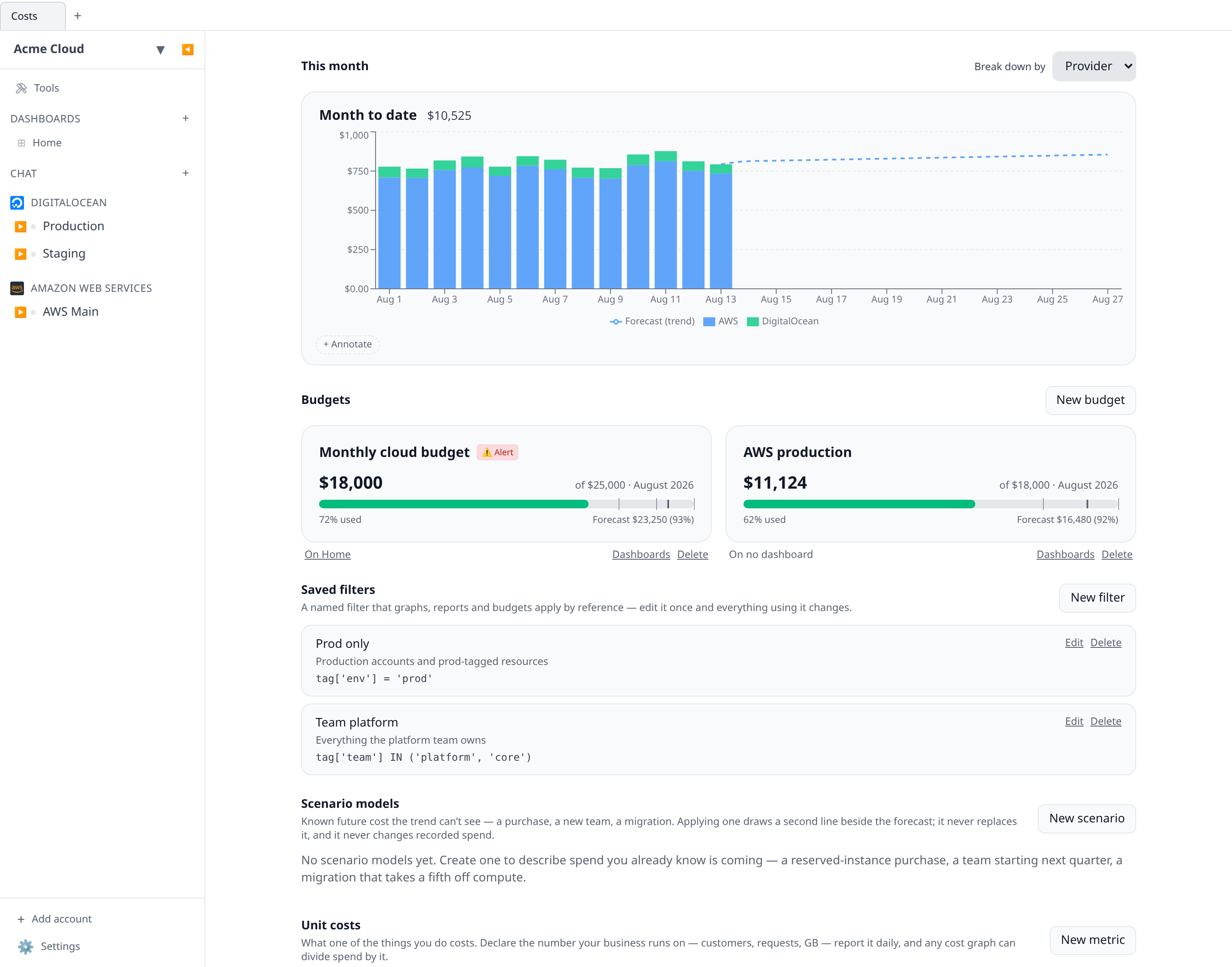
Unit costs
Under the saved filters, Unit costs lists the org’s business metrics — the denominators a cost graph can divide by — with how many days each one actually has values for. A metric nobody is reporting draws a chart made entirely of gaps, and this is the only place that failure is visible, so a metric with no values says so in amber. See Unit costs & margin.
Potential savings
Below the budgets, Potential savings lists resources that look orphaned or idle — volumes attached to nothing, IPs assigned to nothing — with the trailing 30-day spend where the provider reports cost per resource. It reads the state your accounts last synced, so it costs no provider API calls. The section also appears in local-only desktop mode, scanning this machine’s workspace without a cost column. See Orphan & idle resource finder for what each provider flags.
Oversized
Under Potential savings, Oversized covers the other half of waste: machines doing real work on more hardware than they use. Infrawrench computes each machine’s p95 CPU/memory over the last 14 days of stored metrics and, where it sits well under the size, recommends the provider’s cheapest smaller size that still leaves headroom — with a live-priced monthly saving and a one-click apply. See Right-sizing.
Sleep schedules
Below that, Sleep schedules manages the org’s off-at/on-at windows: stop a staging VM at 19:00 and start it at 08:00, Mon–Fri, with the projected monthly saving computed from its trailing spend. Schedules are created from an eligible resource’s Schedule tab; this section lists them all with the next transition, the last run’s outcome, and pause/edit/delete. See Sleep/wake schedules.
On your phone
Cost graphs and budgets render on the mobile app too — the same query, the same series colors, the same thresholds and forecast marker, drawn natively. The Costs tab mirrors the panel: month-to-date spend and every budget in the org, so a budget push always has somewhere to land even when no dashboard shows that budget. Cost cards also appear on whichever dashboards carry them. Creating and editing works there too: Edit on a dashboard offers the same Add a card choices and the same graph and budget editors, rendered as chips rather than dropdowns. Only a cost graph’s custom absolute date range stays on web and desktop.
Ask the model instead
The same cost data is exposed through the MCP server and the AI chat as query_costs, list_cost_dimension_values, get_cost_status, and the budget tools — so “what did we spend on AWS last month, grouped by service?” works from Claude Desktop or the in-app chat without building a graph first. Cost and budget tools respect the caller’s costs:read / budgets:* role permissions.
Where the data comes from
Each provider plugin that supports cost reporting fetches spend from that provider’s own billing API, once a day per account (billing APIs are rate-limited, and some — AWS Cost Explorer — charge per request). When you first connect an account, Infrawrench backfills up to a year of history in the background; the graph shows “Backfilling…” until it completes. Recent days are re-fetched on every collection so provider restatements (late-arriving usage, credits) are absorbed.
The backfill is only considered done once it has actually returned a row. A provider that is set up correctly but has nothing to report yet — a billing export switched on an hour ago — keeps its full history window until real data arrives, so the history is not skipped just because the first attempt was early.
Some providers only publish monthly invoice totals rather than daily costs. Their spend appears on period boundaries, and daily-binned graphs will show it as month steps — the graph notes this when such a provider is in scope.
Spend from somewhere else
For anything with no provider plugin — a SaaS invoice, an internal chargeback, a colo bill — you can report the numbers yourself, and they land in the same store the collectors write to, so they show up in graphs, dimension filters, and budgets like any other spend. Two ways in:
- A workflow calling
infra.costs.write(...), when the numbers are reachable from Infrawrench. These report Workflow as their provider and, unless the workflow attributes them to one of your accounts, appear in the account dimension as “<workflow name> (workflow)”. - A server of your own pushing rows over the API to
POST /costs/rows, when they aren’t. These report External as their provider and appear as “<source> (external)”.
Either way, re-reporting a day restates it rather than adding to it, and neither can overwrite a row a provider collector wrote.
When collection fails
Collection runs unattended and retries with a growing backoff, so a provider that needs setup would otherwise just look like an account with no spend. Instead, the last failure is kept against the account and shown as a banner above the cost widgets on the dashboard — on web, desktop, and mobile alike:
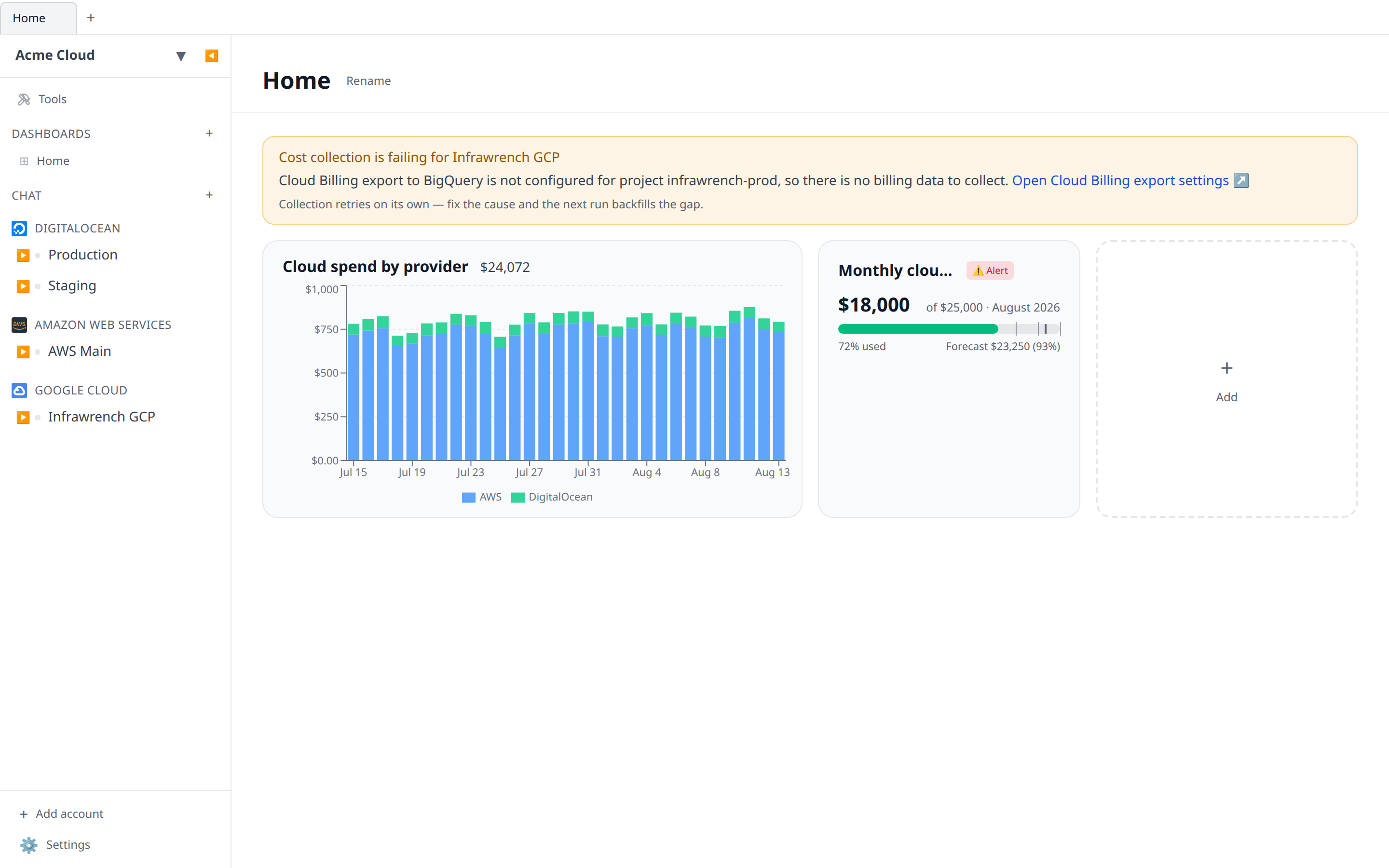
Where the plugin can tell exactly what is missing, the banner carries a link straight to the provider page that fixes it — for example GCP’s Cloud Billing export settings for the account’s project. Fix the cause and the next collection backfills the days that were missed; the banner clears itself on the first success.
infrawrench costs prints the same warnings above the chart, and includes them as collectionFailures under --json. The get_cost_status MCP tool and GET /costs/status return the failure as costPollError with an optional helpLink.
When there is nothing to collect yet
Collection can also succeed and come back with nothing. This is normal for a freshly configured provider: GCP’s Cloud Billing export to BigQuery, for instance, creates its table immediately but can take a day or two to write the first rows, and until then every collection legitimately returns no spend.
Because nothing failed, there is no error to report — so the account gets its own, calmer banner instead of a blank graph with no explanation:
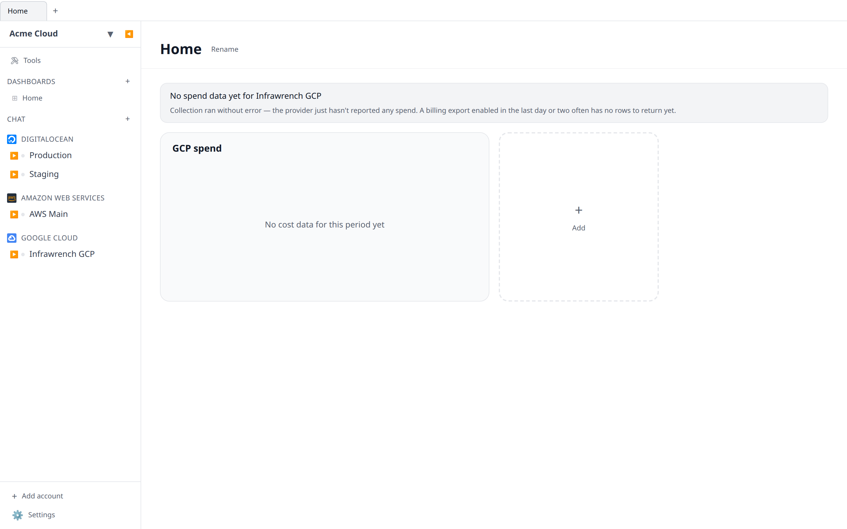
It clears itself the moment the first row lands. If it persists for more than a couple of days, the export is usually configured but not actually delivering — check it at the provider rather than in Infrawrench.
infrawrench costs lists these accounts above the chart too, and includes them as awaitingData under --json. Over GET /costs/status the state is an account with no costPollError and a null coverage.
See each plugin’s page under Plugins for what its cost integration needs (extra IAM permissions, token scopes) and any caveats such as list-price-only dollars.
Kubernetes clusters have no billing API of their own, so their per-namespace and per-workload numbers are derived from node prices rather than collected — see Kubernetes cost allocation.
Forecasts are trend estimates
Forecasts are a least-squares fit over the trailing 30 days of daily totals, projected forward. They are a trend estimate, not a billing prediction — one-off purchases, reserved-instance charges, and tier changes will not be anticipated.
The things a trend cannot see are exactly what a scenario model is for: known future cost, written down once and overlaid on the projection beside the trend rather than instead of it. See Scenario models.
The fit follows the graph’s cost basis, which matters more than it sounds: fitting a trend through a cash series containing one enormous commitment purchase projects a month-end total that cannot happen. On an amortized basis that purchase is already spread, and the forecast is fit on the shape of your actual consumption.
What you report internally
Collected spend is what the provider charged. What an organization reports internally is often different — a platform team’s markup to recover shared overhead, a discount negotiated outside the provider’s pricing, a shared cluster charged back to the teams that use it.
Billing rules express that, and they are applied when a report is run rather than written into your cost data — so collected spend stays exactly what the provider reported and still reconciles against the invoice, while an adjusted figure is always shown beside the collected one and names the rules that moved it. See Billing rules.
Budgets, anomaly detection, change alerts, the digest and cost exports all keep measuring collected spend; a budget can opt in per budget. That page states every one of those decisions.
What you bill somebody else
If you run infrastructure on other people’s behalf, the last step is a document. A managed account is a customer — contact details, a billing currency, and the cost centres whose spend is theirs — and an invoice is what you send them: line items derived from exactly the same allocation the showback report uses, the adjustments applied, and a total that freezes the moment you approve it so it cannot restate underneath a customer who already has it. See Managed accounts & invoices.
Prepaid credit
Cost graphs answer “what did we spend”. For providers that work off a prepaid pot rather than an invoice, the more urgent question is “how long until it runs out” — see credit burndown, which sits on the same Costs panel.
Commitments
The other question a spend graph can’t answer is “are the reservations and savings plans we bought actually paying for themselves”. See Commitments — the holdings, how much of the usage bill they cover, their utilization, and a planner that sizes what to buy next — also on the Costs panel.
Where the egress went
A spend graph can say AWSDataTransfer cost $4,100. It cannot say which two services were talking, because every cost dimension describes one side of a transfer and a network charge is about a pair. See Network costs — priced source→destination attribution read from your VPC flow logs, on the same Costs panel.
Those figures are estimates and are kept deliberately apart from collected spend: adding a derived second opinion of data transfer to the numbers on this page would double-count the same bytes.
Budgets and cost policy in Terraform
Everything on this page that is configuration rather than data — budgets, saved filters, cost centres and their allocation rules, reports, change alerts, scenario models, billing rules and exports — can be managed from Terraform instead of the UI, one object at a time, with plans and terraform import. See the Terraform provider.
It is a different feature from Terraform export, which writes your cloud resources out as HCL, and from config as code, which moves a whole organization’s configuration as one document.