Cost reports
Save a cost graph as a named, addressable report, run it by name, and show it on as many dashboards as you like.
A cost graph on a dashboard is a card and nothing more: it belongs to that dashboard, it has no name anyone can say out loud, and rebuilding it somewhere else means re-picking the chart type, the binning, the grouping and every filter.
A cost report is the same graph as an object. It has a name, its own page, and an id — so it can be run from the CLI or from chat, and dashboards can point at it instead of copying it. Edit the report once and every dashboard showing it updates.
Cloud only. Reports are org rows over spend collected by Infrawrench Cloud’s background pollers. On the desktop app the Reports tab appears when you are signed into a cloud org; local-only mode has no spend to report on.
Open the Reports page
Reports in the sidebar, next to Costs. It lists every saved report in the org, what each one charts, and how many dashboards carry a card for it.
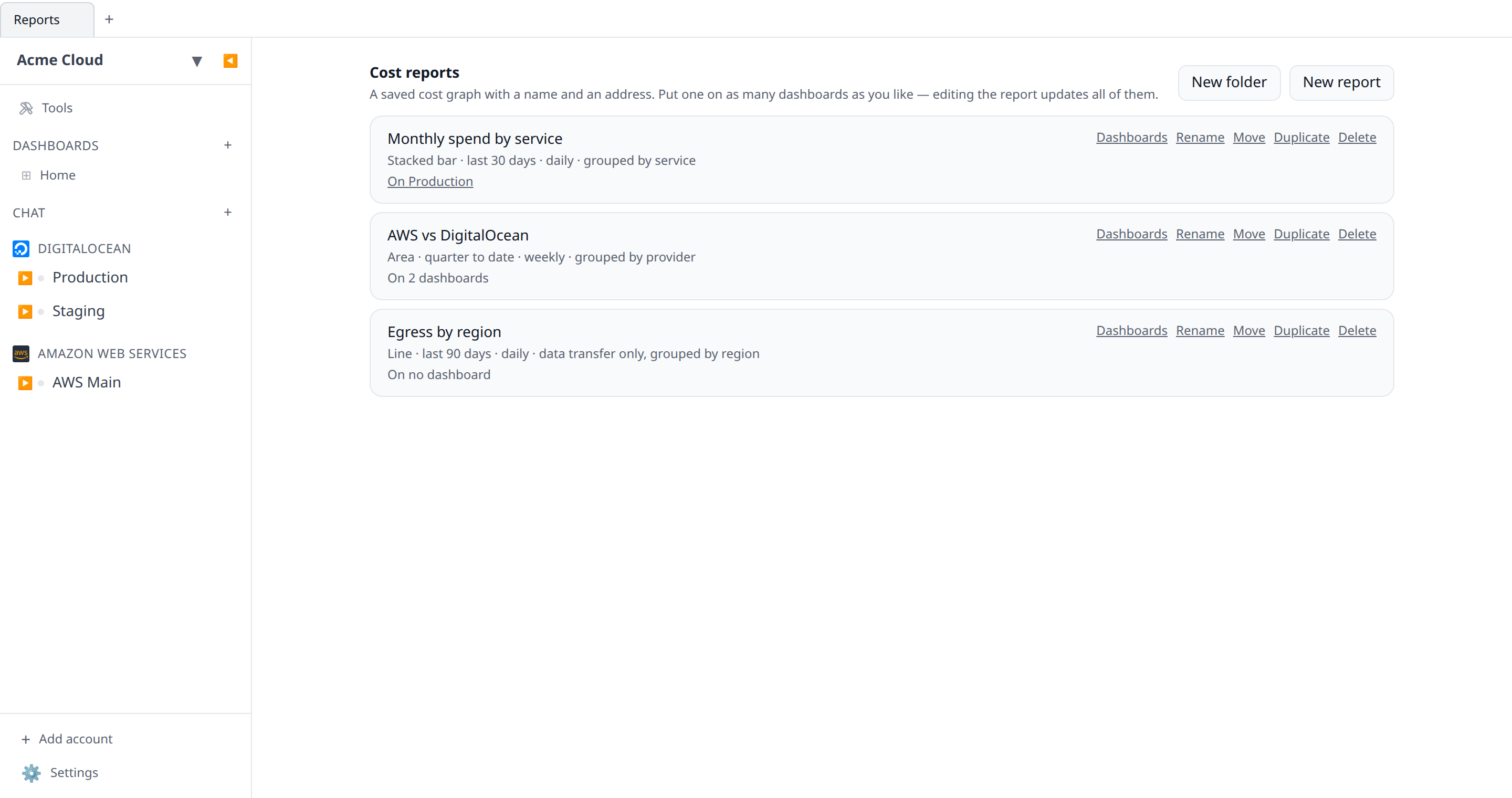
Create a report
- Open Reports and click New report.
- Give it a name and configure the graph — the same editor a dashboard cost graph uses, with the same chart types, binning, date ranges, group-by, filters, cost basis, comparison and forecast options.
- Save. You land on the report’s own page.
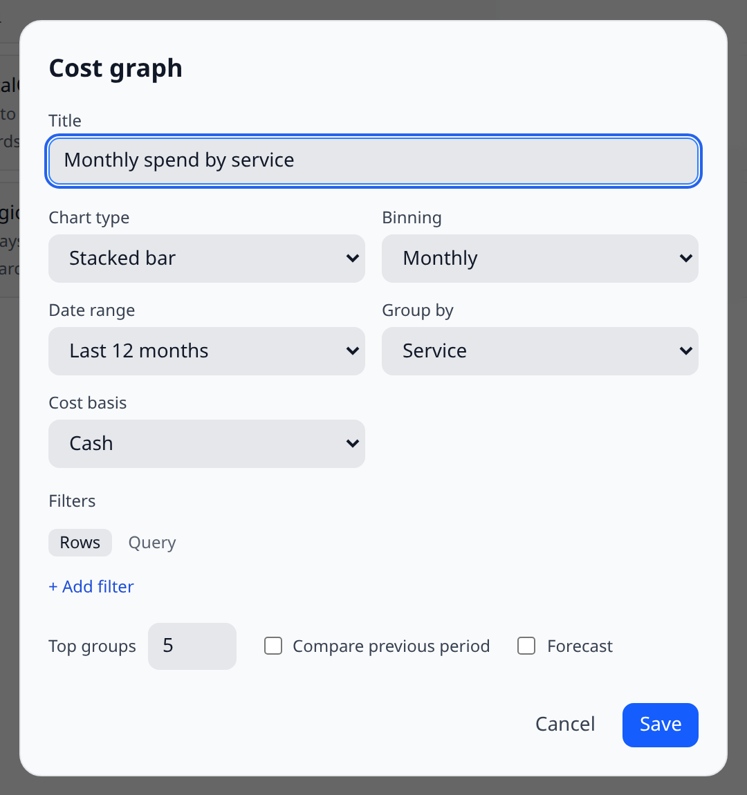
A report saved with a relative date range (“last 30 days”) means a different window every day it runs, which is usually what you want. Pin it to fixed dates with an absolute range instead.
The report page
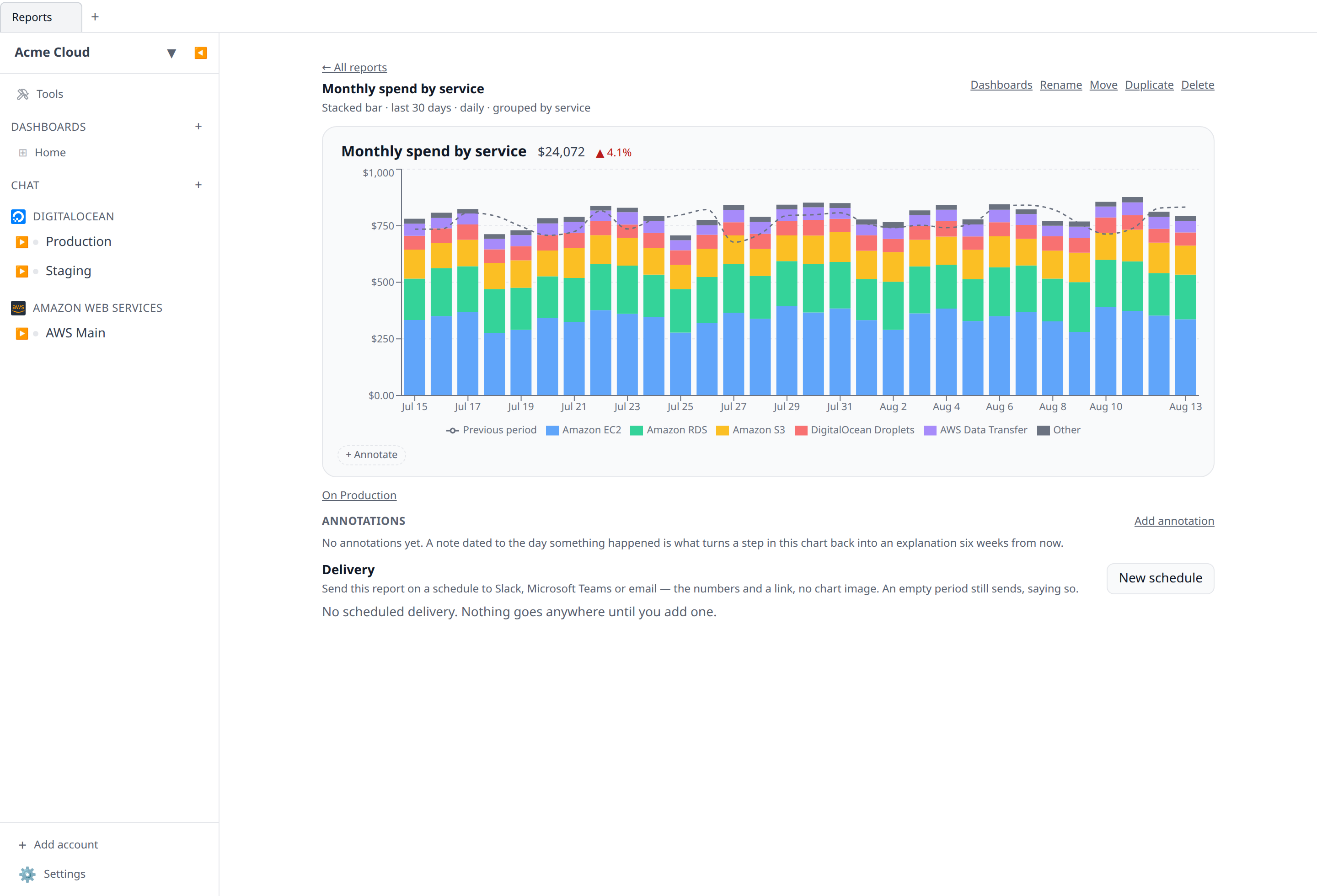
The report’s page draws the chart full width, with the report’s name, its description, and the dashboards it appears on. From here you can:
- Edit — change the graph. Every dashboard showing this report changes with it.
- Rename — the name is how people ask for it, in chat and on the command line.
- Duplicate — copy the config under a new name, so a variant does not mean editing the shared original.
- Dashboards — add or remove its cards, one per dashboard.
- Delete — see below.
Folders
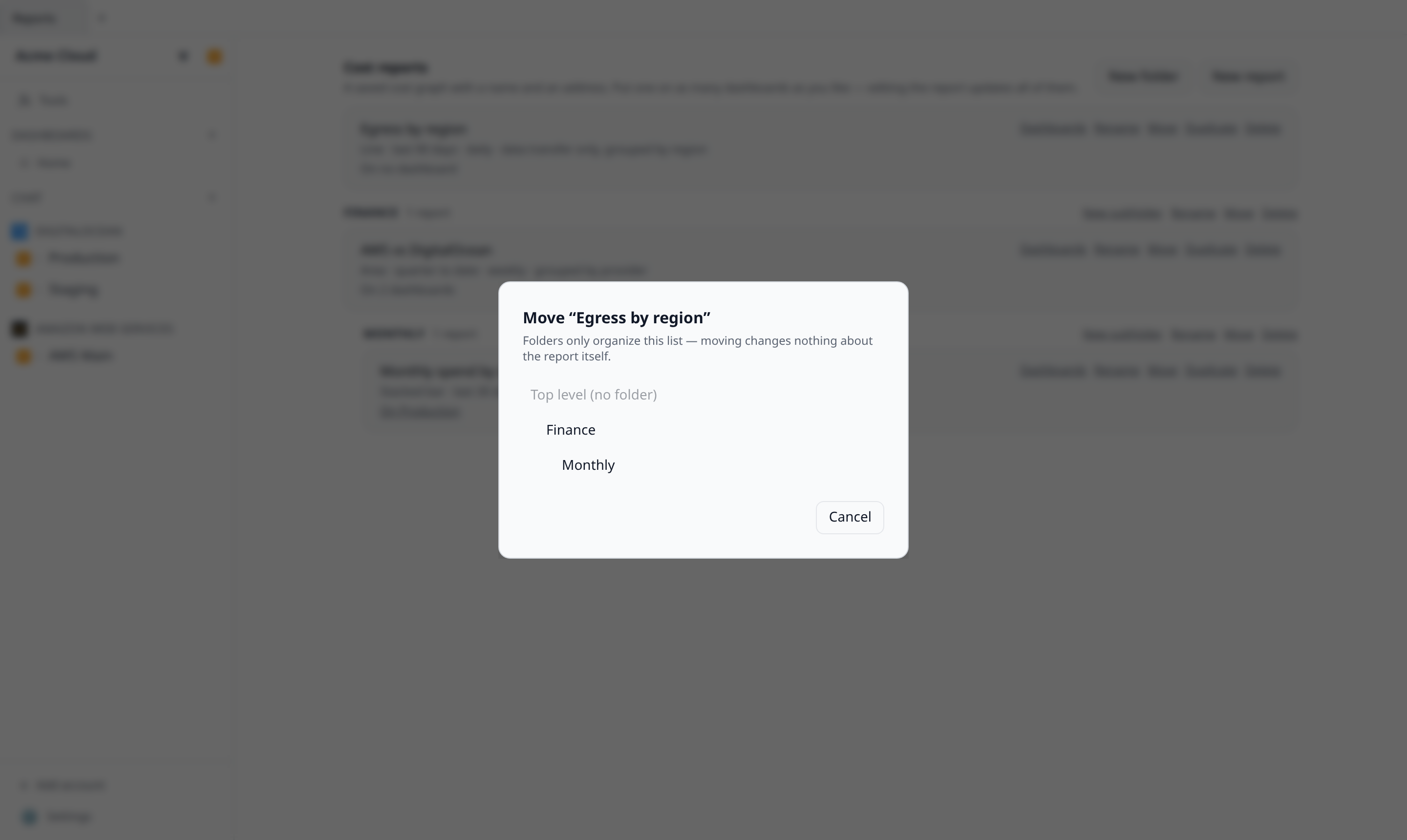
Once the list grows past a screenful, group it. New folder on the Reports page creates one; every report and folder has a Move action that files it wherever you like, and each folder offers New subfolder, Rename, Move, and Delete. Folders nest up to three levels deep — enough for “team / area / month” without turning the list into an expedition.
Folders organize the list and change nothing else. A report keeps its id, its URL, its dashboard cards, and its name-based matching in the CLI and chat no matter where it is filed. Two things follow from that:
- Deleting a folder never deletes a report. The folder’s reports move to the top of the list and its subfolders become top-level folders — the confirmation says exactly that before anything happens.
- Moving is always safe. The one thing the server refuses is a move that could not mean anything: a folder cannot be placed inside itself or one of its own subfolders, and nothing can nest past the three-level limit. The move menu greys those targets out.
On the command line, infrawrench reports shows each report’s folder path (Finance / Monthly) in its own column, and --json includes the folder list. The mobile app groups its read-only list the same way. In chat and MCP, list_cost_reports reports each item’s folderPath and move_cost_report files a report by folder path, name, or id.
Show a report on a dashboard
A dashboard’s + tile offers both kinds of cost chart:
| Menu entry | What you get |
|---|---|
| Cost graph | A one-off card owned by this dashboard. No name, no report, nothing else sees it. |
| Saved report | A card pointing at a report. Editing the report updates this card and every other one with it. |
Both exist on purpose: putting one chart on one dashboard should not require naming and filing a report first.
A report card has no Edit of its own — it opens the report’s page instead, where the list of everywhere else it appears is visible. Changing a shared report from one of its cards, without seeing the other four, is exactly the mistake this avoids.
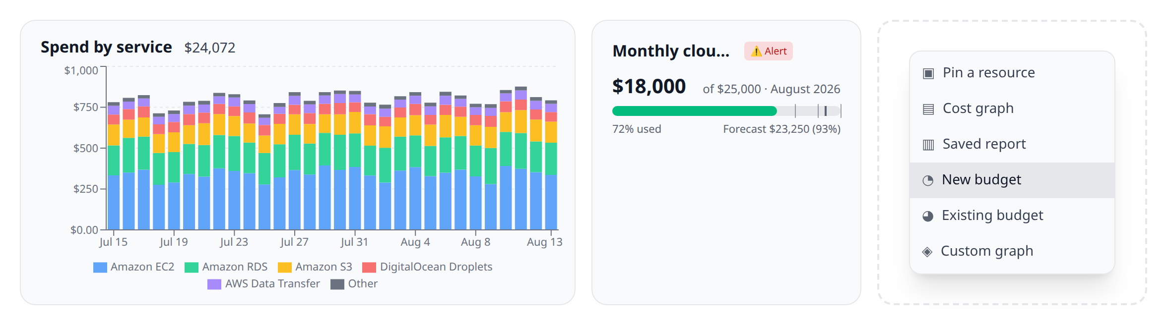
Cards vs the report itself
The two directions are deliberately not symmetrical, the same way they are for budgets:
| You do this | What happens |
|---|---|
| Remove a report card from a dashboard | The card goes. The report stays, and every other dashboard keeps its card. |
| Delete the report from the Reports page | The report goes, and every card pointing at it is removed at the same time. |
A card whose report no longer exists could only ever render as an unavailable tile that no amount of dashboard editing explains — so deleting a report takes its cards with it. The confirmation names the dashboards that will lose a card before anything happens. Deleting a report also removes its delivery schedules — a schedule is meaningless without the report it delivers.
Scheduled delivery
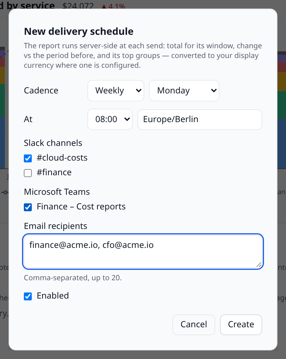
The Delivery section on a report’s page sends it on a schedule to Slack channels, Microsoft Teams webhooks, and email addresses — the digest model: each schedule owns its own destinations, chosen when it is created.
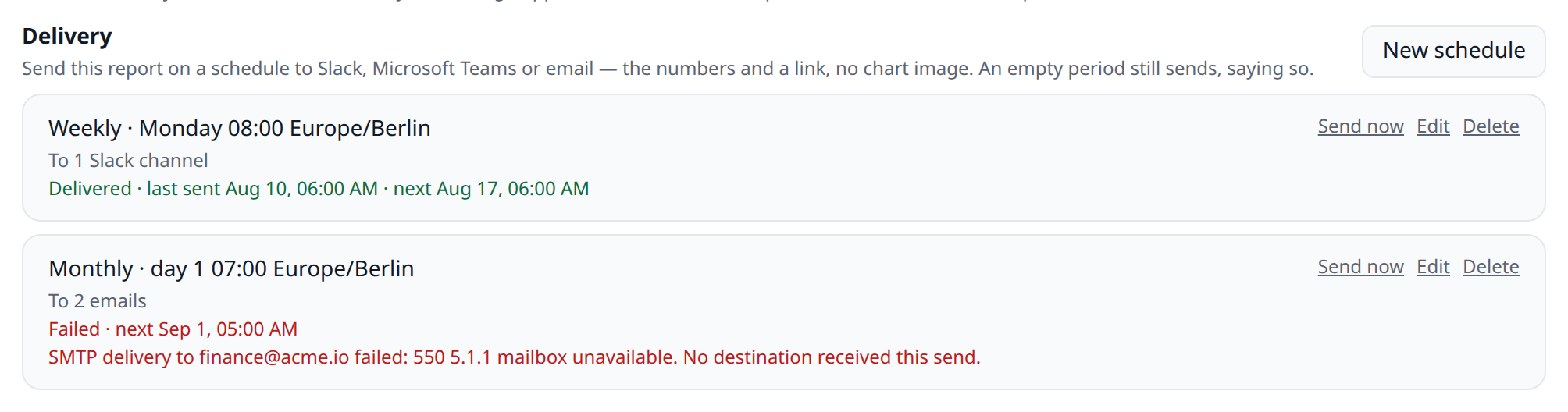
Each schedule has:
- A cadence — daily, weekly (pick the weekday), or monthly (pick the day of month). A day the month doesn’t have clamps to its last day, so “the 31st” means month end in April too.
- A local hour and time zone — 08:00 in
Europe/Berlinstays 08:00 through daylight-saving changes. - Destinations — any mix of the org’s connected Slack channels, its Teams webhooks, and a list of email addresses (which can reach a finance alias with no Infrawrench login). A schedule can only point at Slack and Teams surfaces the org already connected.
What arrives is a composed text summary: the report’s total for its window (converted to your display currency where one is configured, with the conversion caveat spelled out), the change against the previous period, the top groups, and a link to the live report. No chart images — that is a deliberate scope line, not an omission: the message carries the numbers, and the link carries the picture; an image-rendering pipeline is a feature of its own.
Two behaviours worth knowing:
- An empty result still sends, saying so. A quiet period and a broken schedule look identical from the receiving end, so the delivery says out loud that it ran and found nothing.
- Failures are visible where you configured them. Each schedule shows its last attempt’s status and error on the report page. A total failure retries with a short backoff (up to three attempts); a partial delivery — Slack took it, Teams didn’t — is never retried automatically, because a retry would post the report twice where it already landed. Send now is the recovery once the failing destination is fixed.
Viewing a report’s schedules needs costs:read; creating, editing, deleting, and Send now need org:settings:write — the same step up cost exports take, because a schedule is standing authorisation to send org spend to addresses its creator picked. Every change and manual send lands in the audit log.
Annotations
A step change in a spend chart explains itself for about a fortnight. After that nobody remembers whether it was a migration, a launch, or a price change — and the answer, if it exists anywhere, is in a Slack thread.
An annotation is a dated note drawn over the chart, so the explanation lives next to the number.
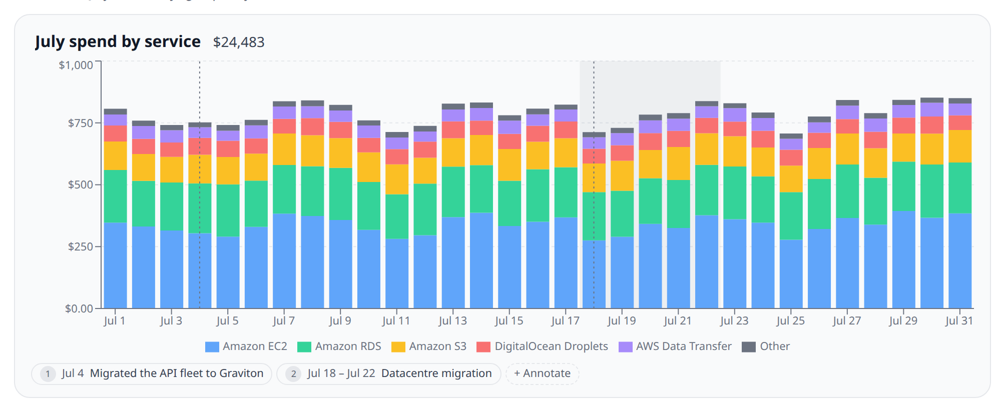
Writing one
Click any bar on the chart and write what happened, or use Add annotation in the Annotations list below it. Either way you get:
- A date — the day the thing happened.
- Spans several days, optionally — a deploy is a moment, a migration is a week. A span shades the buckets it covers instead of marking one.
- The note itself — up to 500 characters.
- Where it shows — every cost chart (the default) or only this report.
Org-wide is the default on purpose. “We changed instance types” is not a fact about one report, and filing it under one leaves every other chart showing the same step with no explanation. Scope a note to one report when it is genuinely about that report’s slice of spend.
How markers land on the chart
A note is dated to a day, but a chart bins by day, week, month, or cumulatively. The marker lands on whichever bucket holds that day at the binning the chart is using — the same bucketing the spend itself went through, so a marker is never one bar away from the money it explains. Switch a chart from daily to monthly and a note dated the 14th moves onto that month’s bar.
Three consequences follow:
- Several notes on one bucket become one marker. Three things that happened in July are one flag on a monthly chart, numbered once; the list underneath shows all three. Markers never overprint each other.
- A note outside the chart’s window is not drawn at all — and never widens the axis to make room for itself.
- A span that starts before the window still marks it, clamped to the first bar shown, because a migration that ended inside this window is information about this window.
Annotations never change the numbers. The series, the totals, the forecast and the axis are identical whether a chart carries ten notes or none — an annotation is an overlay on the picture, never a row in the data.
Reading them without a mouse
Every marker is also a button in the strip under the chart, showing its number, its date and its text. Tab to one and press Enter to expand every note on that bucket, with Edit on each. Nothing about annotations is hover-only, which is also what makes them work on a phone.
Notes that came from an anomaly
Some notes are not written from a chart at all. Explaining a detected cost anomaly creates one automatically: dated to the anomalous day, scoped org-wide, with the sentence somebody wrote about what the spike was. Those markers say Explains a detected anomaly next to their date, so a claim on a chart can be checked against the finding it closed rather than taken on trust.
From that moment it is an ordinary annotation — reword it, narrow it to one report, move its date, delete it. Deleting it removes the marker only: the anomaly stays explained and does not go back to being an open question. Re-explaining the anomaly rewords this note rather than adding a second one to the same bar.
Managing them
The Annotations list on a report’s page shows every note the report’s chart draws — its own and the org-wide ones, each labelled with which it is. That is where you go to fix a date you can no longer see, reword a note, move one between org-wide and this report, or delete it.
Reading annotations needs costs:read; writing them needs costs:write. Every create, update and delete lands in the audit log.
From the command line
infrawrench reports                     # every saved report, with its folder, shape, dashboards and delivery schedules
infrawrench reports "Monthly spend"     # run it and chart it in the terminal
infrawrench reports "Monthly spend" --json
infrawrench reports send "Monthly spend"  # deliver it to its schedules right now
The delivery column shows each report’s schedules and calls out failing ones; reports send is behind an explicit verb because it posts into channels and inboxes.
The name is matched exactly first, then as a substring; an ambiguous query lists the candidates rather than picking one, because running the wrong cost report produces a wrong answer that looks right. An id works anywhere a name does. See the CLI.
From chat and MCP
Reports are exposed to the MCP server and the AI chat as list_cost_reports, get_cost_report, run_cost_report, create_cost_report, update_cost_report, move_cost_report, and delete_cost_report — so “run the monthly spend report” works without restating a filter set. run_cost_report takes only the report’s id and returns the series along with the window a relative range resolved to. move_cost_report files a report in a folder by path, name, or id — or back at the top level with null.
Reads need costs:read and writes need costs:write; see roles & permissions. Every create, update and delete lands in the audit log.
On your phone
The mobile app lists your saved reports — grouped under the same folders you keep on web and desktop, with each section titled by the folder’s full path — and opens any one of them read-only: the chart, the description, the dashboards it feeds with a tap through to each, and its delivery schedules with each one’s last-send status and error. Report cards on a dashboard render there too.
Creating or editing a delivery schedule stays on web and desktop, deliberately: a schedule names Slack channels, Teams webhooks and email addresses — org-egress decisions that belong next to the pickers that make them safe.
Annotation markers are drawn on the phone’s charts too, with the note text a tap away. Writing one stays on web and desktop with everything else: a note’s scope choice can change what every chart in the org shows, and that is not a decision to make on a bus.
Creating and editing a report stays on web and desktop, and so does managing folders — the phone reads the filing, it doesn’t refile. Choosing choosing a chart type, a binning, a group-by and a filter set is a desktop job, and a half-editor on a phone is the fastest way to change a report that five dashboards depend on by accident.
When a report is worth making
- More than one person asks for the same breakdown, so it needs a name.
- The same chart belongs on two dashboards and you do not want to maintain both.
- You want the numbers on the command line, or want to ask chat for them, without restating the filters.
A chart you will look at once is still just a Cost graph on a dashboard, and that is fine.